AM.
While teaching at Shillington, I was tasked with creating example work for the course, like this branding project. The task was to take a well known brand and shift its perception into a more progressive space. What better brand to tackle than everyone’s favourite toxic body spray company: Lynx.
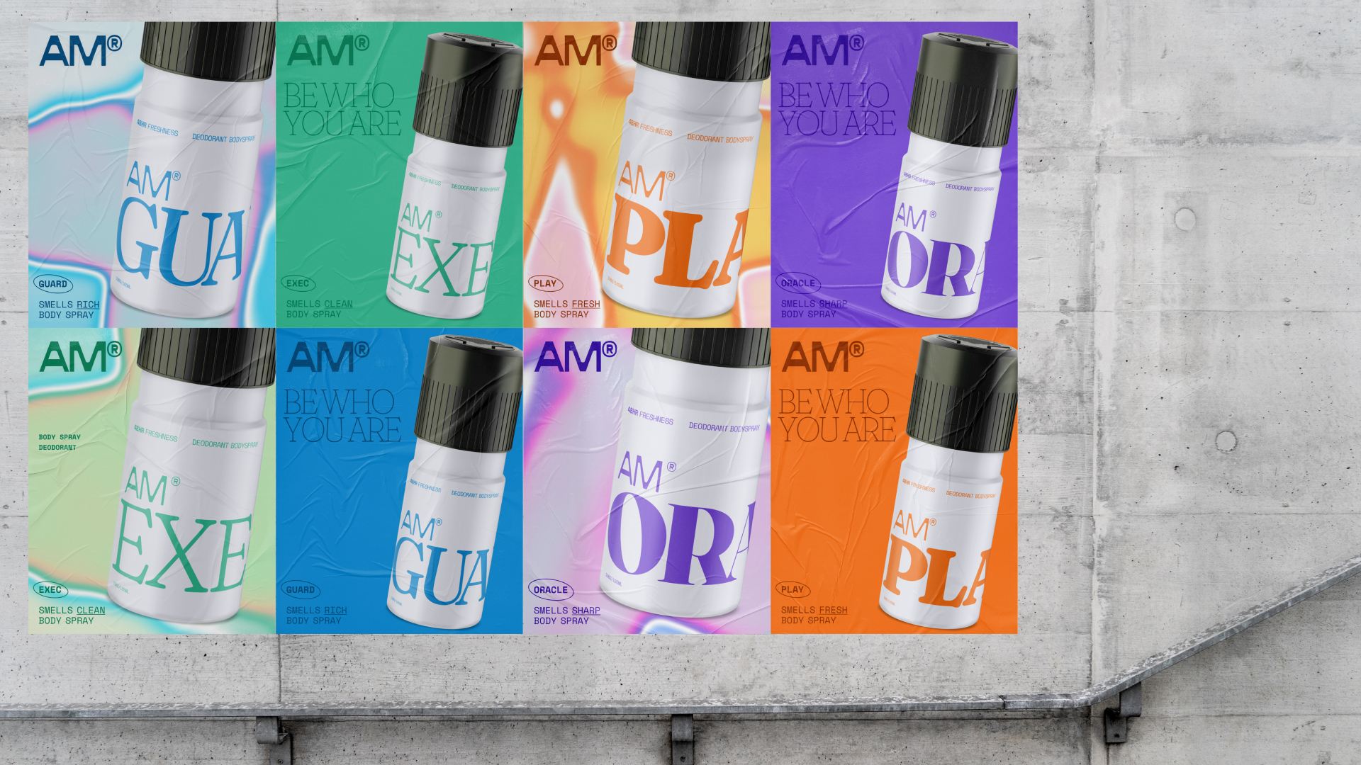
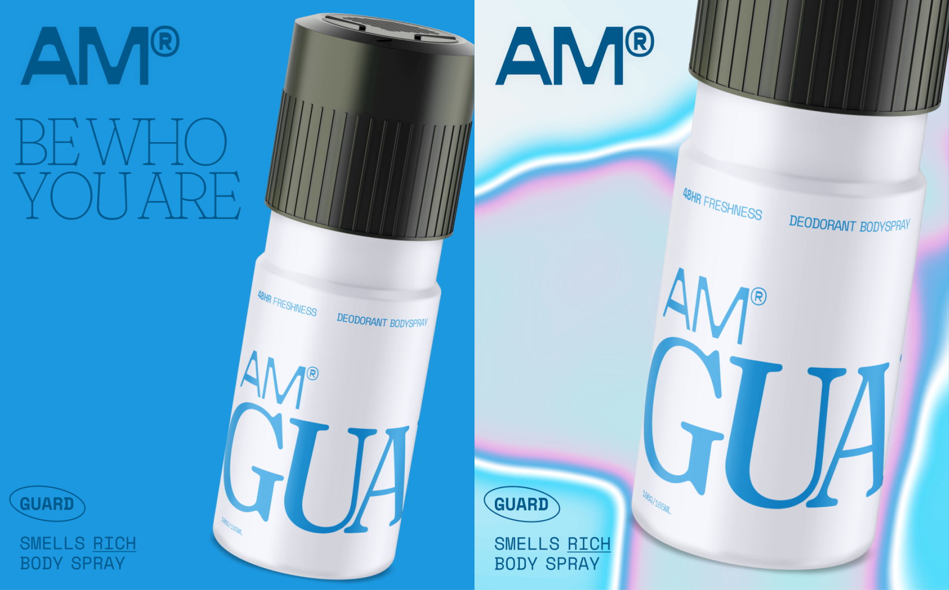
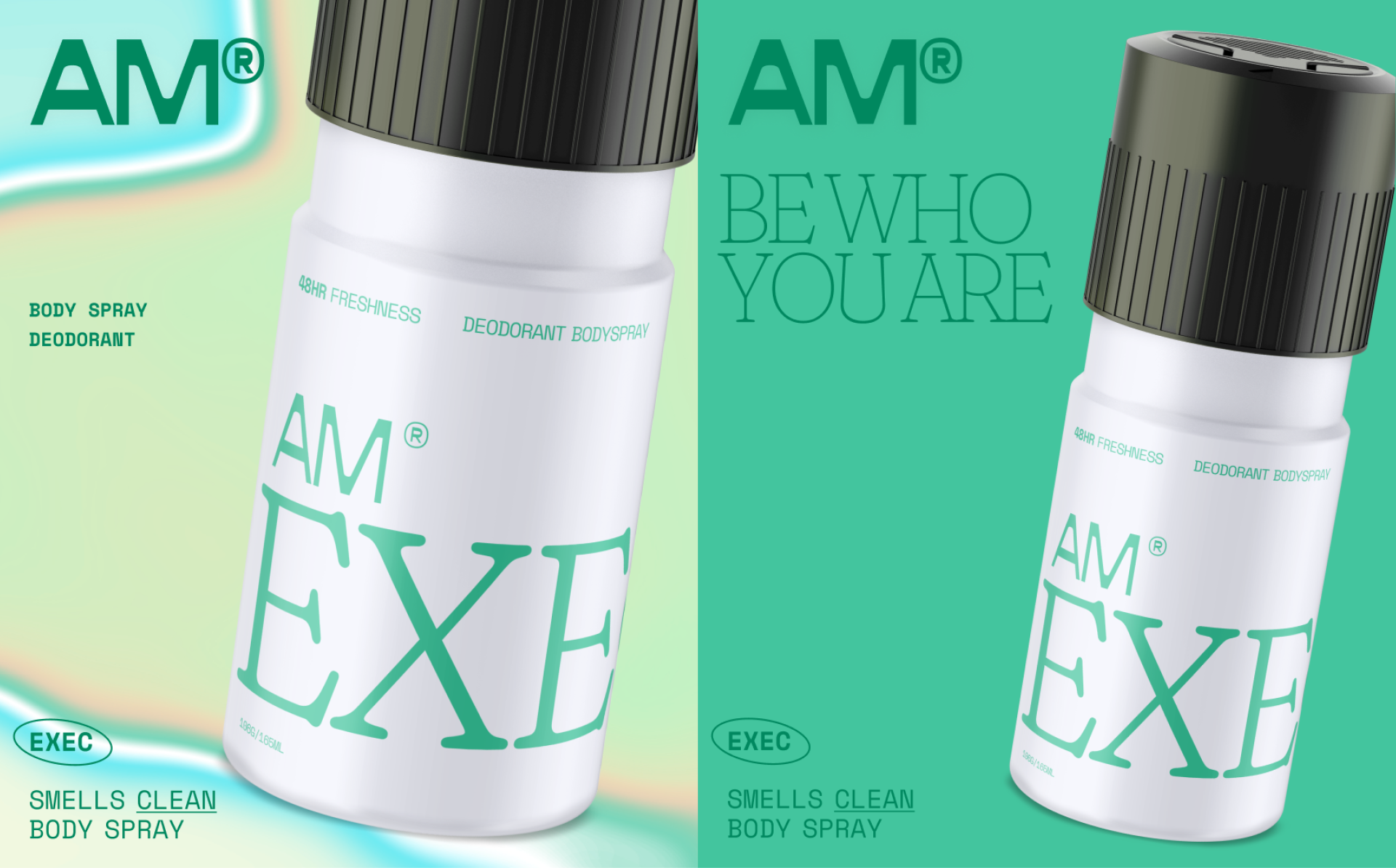
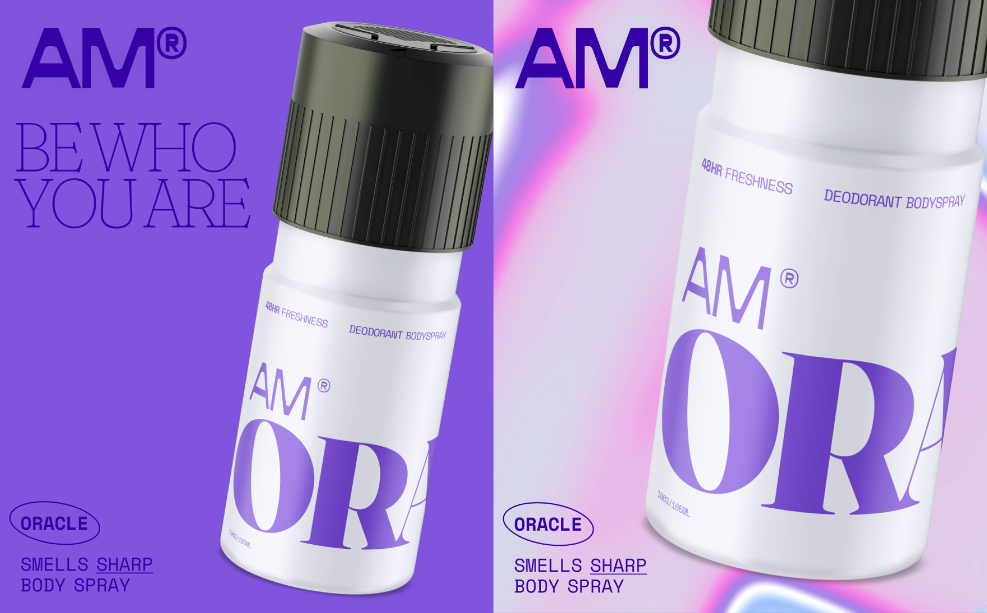
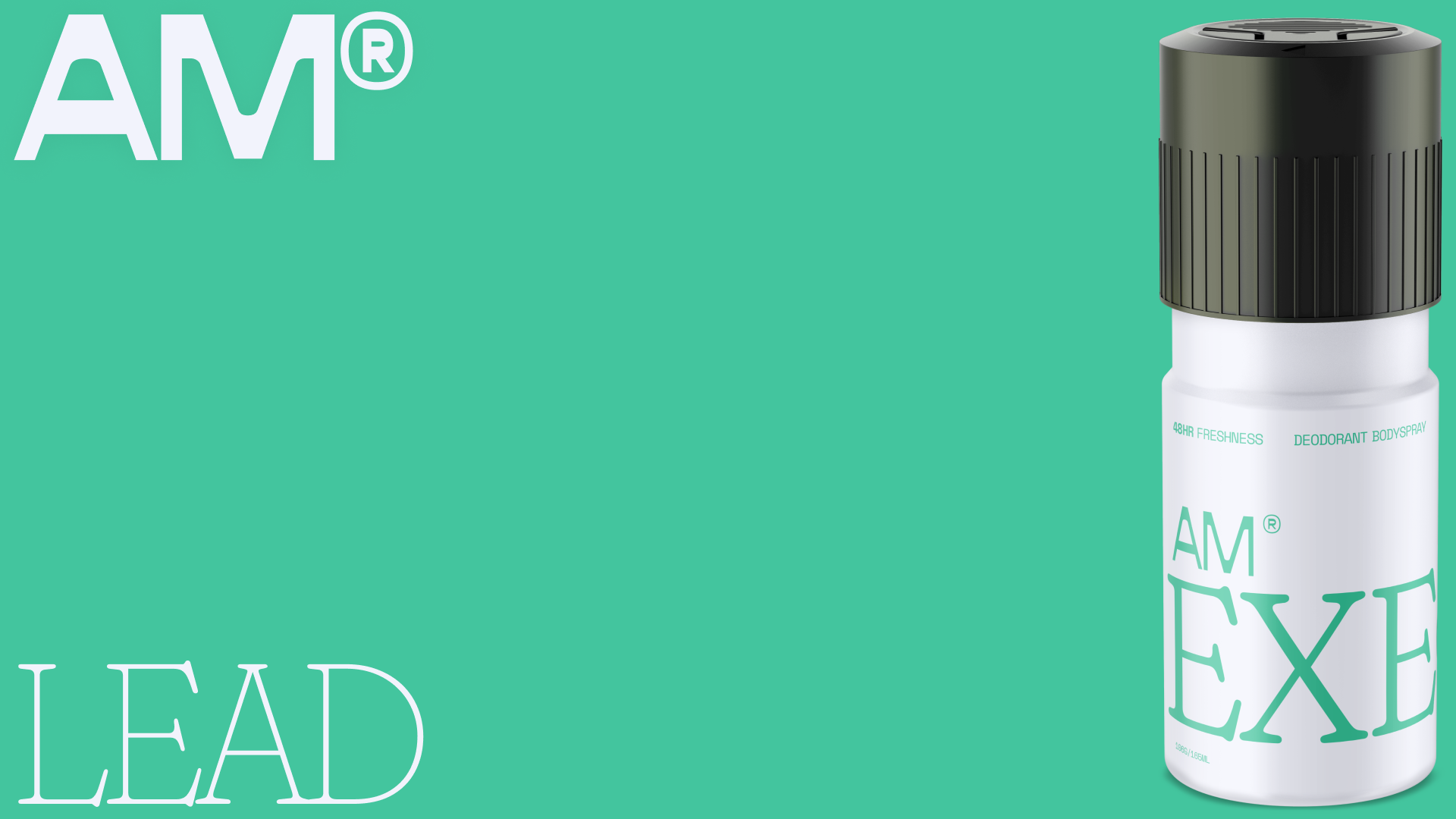
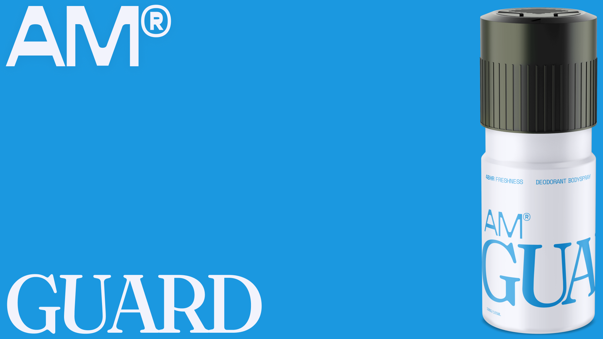
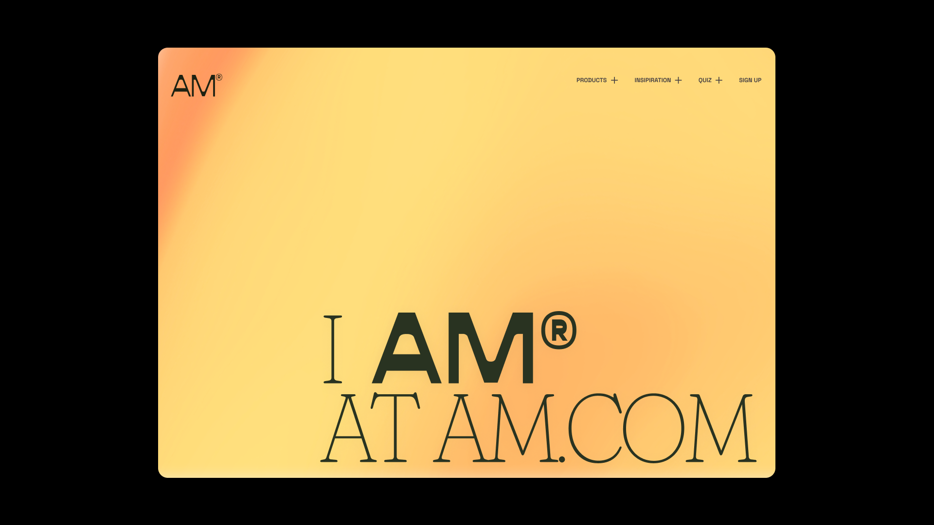
I renamed ‘Lynx’ to ‘AM’ to allow for the brand to be accessible to everyone, whoever they are. ‘I AM’ is a confirmation of self. It is confident and accepting. It also has a nice double entendre of a product behaviour, which is daily morning application.’ ‘AM’ encourages younger people to "sweat their way”.
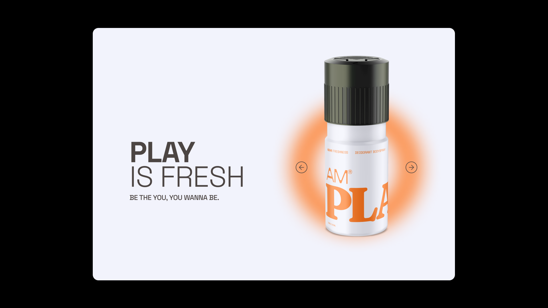
The colour palette is split into the 4 hero product categories. Play, Guard, Lead and Teach. These are represented with one main tone and a gradient to represent states of flux. I've utilised typography with lots of wiggle room in its different cuts, allowing the cans to share a consistent feel while still being as unique as our audience.